
Where it broke down
Trip Assistant buttons would not click“Fill empty days” and “Start: Tell the day story” sat on screen like the main event: then ignored every click. Three retries, zero progress. That is where new agencies die.
Complete sample report
This report comes from a real ColdVisit audit of TripAutomate. The agent arrived with no context, judged the page as a first-time visitor, started a free trial, created a trip, and kept going until first value: or the exact button that blocked it. Every recommendation below is grounded in that visit.
Overall score
Easy to start. Broken at the finish line.
The short version
TripAutomate removes every classic objection: no card, $10/seat, Google signup in under two minutes: then strands the new agency at Trip Assistant, where “Fill empty days” looks ready and does nothing. That is not a polish issue. That is burning paid attention after you already won the click: zero peer proof on the page, and a dead aha button inside the product.
Onboarding activation
First value meansUser generates their first itinerary
Signup worked. Creating “Paris Trip” worked. Then the money moment broke: the Trip Assistant’s “Fill empty days” and “Start: Tell the day story” buttons looked ready, but three clicks did nothing. The page froze in place, the run stopped, and no itinerary ever appeared: so first value never landed.
How far the run got
Friction across the run
0 is effortless · 10 is blockedWhere it broke down
Trip Assistant buttons would not click“Fill empty days” and “Start: Tell the day story” sat on screen like the main event: then ignored every click. Three retries, zero progress. That is where new agencies die.
Fix this first
Fix the dead Trip Assistant buttons firstWhen the panel opens on a brand-new empty trip, check for disabled state, invisible overlays, or a silent prerequisite (like destinations). Make the primary action actually clickable.
What the flow demanded
Agent context
Get an agency owner into a free trial tonight: then make them feel the product work before they bounce
Assumptions the agent respected: The buyer is also the user: if signup or first value feels hard, there is no sales team to rescue the deal At $10/seat they will try fast: but they will also churn fast if the first itinerary never shows up
Capture notes: animated-page:spa-shell,transform-motion
Agent browsing evidence
Each selected action was opened from a clean browser state, so one test could not influence the next.
Isolated click tests
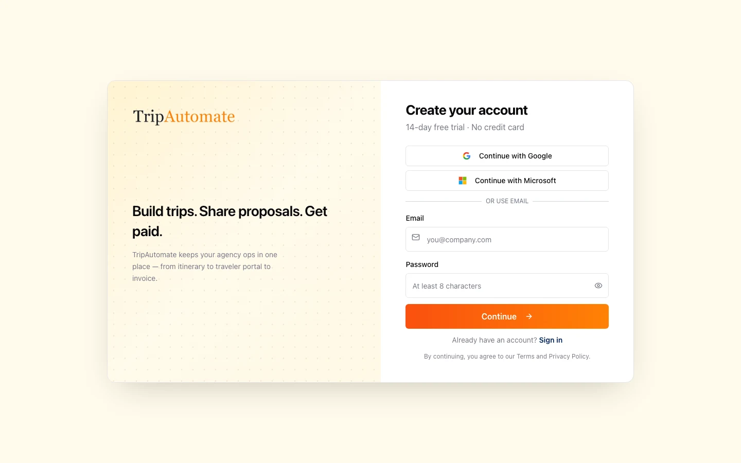
Final destination and observed browser behaviorNavigated to https://www.tripautomate.com/register
https://www.tripautomate.com/registerThe CTA test reached the audit time budget before a reliable result was observed.
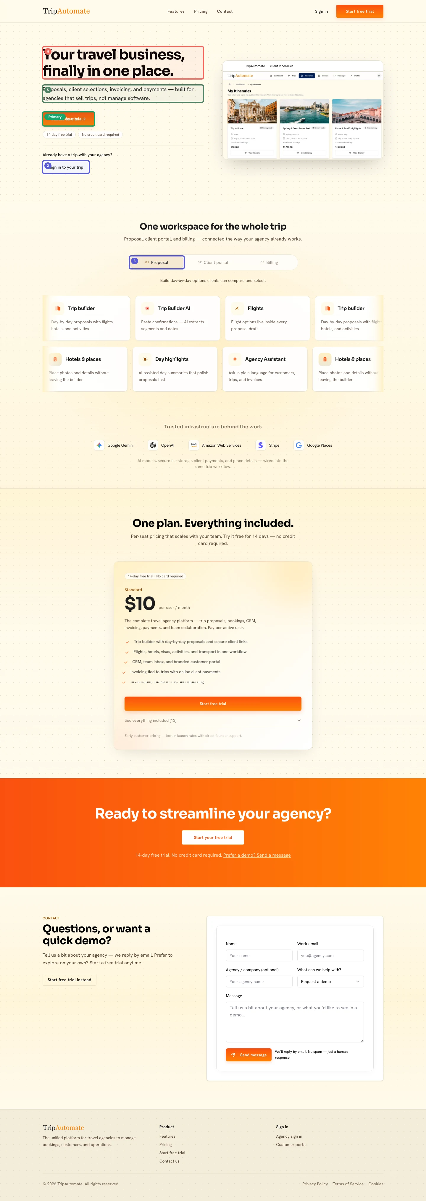
https://www.tripautomate.com/The agent journey
Agency owners self-identify in seconds. The catch: “finally in one place” is a promise every tool makes, so differentiation still has to earn its keep.
You can see the workflow. You cannot see a single peer who already runs their agency on it: and that is when intent cools.
The handoff is clean. If the landing page had one agency quote above this button, this would feel like a no-brainer instead of a brave try.
Honest verdict
Landing makes trying feel safe and cheap. Onboarding walks the user all the way to “Paris Trip,” opens the assistant, and then the generate controls ghost three clicks in a row. Add the missing social proof on the page and you still lose them if first itinerary never appears: so the real leak is promise → product, not another hero tweak.
Strategy the agent spotted · smart
Collapsing B2B friction at signup is the right bet for SMB agencies: but only if the click after signup pays off. Right now the page wins the trial and the product drops the bag at first value.
If signup stays this easy and first itinerary actually works, agencies can feel the whole money loop before they ever talk to sales.
A frictionless trial with no proof on the page: and a broken aha inside: trains new agencies that TripAutomate looks good and fails when it matters.
Pricing promises 14 days free with no card; the agent did create an account and a trip: then died on the Trip Assistant generate controls.
Content quality evidence
You pay a fixed amount for each individual user account on your team, rather than a flat fee for the whole company.
Single Sign-On lets you create an account using your existing Google or Microsoft login instead of setting a new password.
A readability standard that measures whether text or buttons are dark enough against their background to be legible for most people, including those with visual impairments.
Score breakdown
Deep dive
You name the right audience, then lean on a consolidation promise every competitor already uses.
The subheadline 'built for agencies that sell trips, not manage software' is a sharp, audience-specific line that immediately separates intent from feature bloat.
'Finally in one place' is a tired framing that gives a scanning agency owner no memorable reason to choose TripAutomate over any other vertical tool.
Replace the headline with the sharpest differentiator already on the page: the proposal-to-payment loop: in concrete language, such as 'Proposals to payment, one trip workflow.'
The page targets independent and small travel agencies clearly, but it never signals whether it fits solo operators, teams, or enterprise TMCs, leaving sizing ambiguity for buyers at the edges.
The 'Pay per active user' model and the 'scales with your team' copy signal that the product grows with an agency without punishing small shops.
No agency size, trip volume, or team-size reference appears anywhere, so a 10-person agency and a solo advisor both land on identical messaging with no confirmation they belong.
Add a single qualifying line near pricing: such as 'Built for independent agencies and growing teams': to reduce self-qualification friction for the most common buyer profile.
The trial CTA is prominent, the register page loaded cleanly, and Google and Microsoft SSO options reduce signup friction to near zero for most agency operators.
Multiple 'Start free trial' placements across the page: hero, pricing card, CTA band, and contact section: ensure the primary action is always within reach.
The 'Sign in to your trip' button produced no navigation within the audit window, so client-facing portal access may not be immediately obvious to a new visitor trying to understand the two-sided product.
Add a brief tooltip or label near 'Sign in to your trip' clarifying it is for end-traveler clients, not agency staff, to prevent role confusion before signup.
Google, Stripe, and AWS logos help: but zero customer faces leave every claim unverified.
Naming five recognizable infrastructure partners in one visual row efficiently signals technical seriousness without requiring a long explanation.
No testimonial, agency name, case study, or adoption metric appears anywhere on the page, making it easy for a risk-averse buyer to dismiss the value claims as unproven.
Drop one short agency quote with a real name and city above pricing: proof at the exact moment of intent.
The feature grid covers the core workflow clearly, but the expandable 'See everything included (13)' list is collapsed by default, hiding half the value case from visitors who do not interact.
The three-tab Proposal / Client portal / Billing structure efficiently shows the end-to-end workflow without requiring the visitor to read a wall of text.
Critical CTA contrast ratios of 1:1 flagged by the renderer mean the orange 'Start free trial' button can become invisible against the cream background on some displays, directly suppressing clicks on the page's primary action.
Ensure the orange button always sits on a dark or white background and add a 1px dark border as a fallback to guarantee visibility regardless of display rendering.
Growth review · 01
Search & discoverySolid metadata and page structure, but duplicate headings and missing image descriptions will limit how well search engines understand and rank the page.
tripautomate.comhttps://www.tripautomate.com/
TripAutomate is the unified platform for travel agencies to manage bookings, customers, proposals, and operations.
Keep thisThe page title, meta description, and social-sharing metadata tags are all present and populated with relevant copy. The single H1 heading matches the hero headline, giving search engines a clear signal about the page's primary topic.
Why this mattersSearch engines read repeated identical headings as thin or poorly structured content, which can suppress rankings for the feature keywords you most want to own.
Recommended changeConfigure the tabbed feature section so that only the visible tab's content is present in the page at any one time, or wrap hidden tab panels with an attribute that prevents search engines from indexing their duplicate headings.
The rendered audit shows H3 headings for 'Trip builder', 'Trip Builder AI', and 'Flights' each appearing eight or more times in the heading list. This is caused by the tabbed feature section rendering all tab states simultaneously in the page code rather than showing only the active tab's content.
Why this mattersImages without descriptions are invisible to search engines, missing an opportunity to rank for visual searches, and they also make the page inaccessible to visually impaired users.
Recommended changeAdd a short descriptive phrase to each image: for example, 'TripAutomate itinerary dashboard showing Rome, Sydney, and Amalfi trips': so both search engines and screen readers can interpret what is shown.
The rendered audit reports 8 total images with 5 missing alt text. The product dashboard screenshot in the hero and the itinerary card images in the feature section are the most likely candidates given their prominence.
Growth review · 02
Look & feelThe page feels clean and purposeful, with a warm cream-and-orange palette that suits the travel category, but two contrast problems make key buttons hard to see on some screens.
Warm cream, orange CTAs, and a real itinerary screenshot make the first screen feel like travel software: not generic SaaS. The dotted texture adds atmosphere without clutter. Typography stays consistent. The weak spot is contrast: when orange meets cream the wrong way, the primary button can disappear.
Based on the captured desktop page. Mobile design was not evaluated.Contact53 × 28px
Sign in76 × 44px
Start free trial Start free trial159 × 44px
Keep thisThe hero product screenshot is specific and credible: it shows real itinerary cards with destinations, dates, and prices rather than a generic dashboard mockup. This gives agency owners an immediate sense of what they would actually see inside the product.
Why this mattersIf visitors cannot clearly see the primary action button, they are less likely to click it, directly reducing sign-ups.
Recommended changePlace the orange button exclusively on white or dark backgrounds, and add a thin dark border around it as a fallback so it remains visible even if the background color renders unexpectedly on a user's display.
The contrast audit flags the header 'Start free trial' button (white text, rgb 255 255 255) against the cream page background (rgb 255 250 235) at a ratio of 1:1, meaning no perceptible difference. The same issue appears on the orange CTA band section. The button is only visible when it renders over a sufficiently dark or colored surface.
Why this mattersExisting clients who need to log in may miss this button and contact support instead, adding unnecessary friction for a returning-user journey that should be effortless.
Recommended changeAdd a subtle label above the button such as 'Already a client?' in a muted color, and give the button a slightly darker border so it reads as a distinct, clickable element without competing with the primary trial action buttons.
The button uses a light outline style (158px wide, 44px tall) on the cream hero background. The visual audit shows no strong border or fill color distinguishing it from the surrounding space, and it sits below the primary CTA with no visual separator to signal it serves a different audience.
Fix this first
Agency owners are about to change how they sell trips. Without a logo, quote, or “used by X agencies,” the trial feels like a leap: even at $10.
After that
“Finally in one place” does not say why TripAutomate wins. Busy owners bounce when the unique angle is vague.
Lead with the money loop you already show: proposals out, clients in, payments back: in one trip workflow.If the orange CTA blends into the cream background, your best visitors never see the ask.
Put that button on white or dark only, and add a thin dark border so it stays visible no matter the display.Scanners rarely expand collapsed lists. Features they never see cannot help them decide.
Surface the three money-making capabilities above the fold of that section: proposals, client portal, billing: before the expand control.Ready to paste
Your travel business, finally in one place
Proposals, client portals, and payments: one trip workflow
Names the job and the money path instead of a generic “all-in-one” slogan.
built for agencies that sell trips, not manage software
Built for agencies that sell trips, not babysit software
Keeps the sharp audience line and makes the pain feel personal and memorable.
Start free trial
Start free: 14 days, no card
Repeats the two objections you already solved, right on the button.
Protect these choices
Trial without the usual B2B tax14 days, no credit card, Google and Microsoft signup: agency owners can try before they rearrange their whole stack.
Pricing you can explain to a partner in one sentenceOne plan. $10 per user/month. Everything included. That honesty alone beats a “talk to sales” wall.
The product screenshot looks like real trip workItinerary cards with destinations and dates beat a generic dashboard mockup: visitors can picture Monday morning.
Missing content
No customer logos, quotes, or “agencies like yours” proof near the trial CTA.
No quantified outcome (time saved, proposals sent, payments collected) to justify switching tools.
No clear “built for solo advisors vs growing teams” line, so edge buyers hesitate.